

Soch
Turn passive scrolling into active discovery
187 followers
Turn passive scrolling into active discovery
187 followers
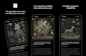
We scroll every day, why not learn something meaningful? Soch curates research articles using AI and presents them in a familiar, effortless feed. With simplified summaries, AI-generated visuals, and personalized interests, discovery feels natural, not overwhelming. Turn mindless scrolling into moments of insight.


Coin Feed
minimalist phone: creating folders
The question is how to make people swap Instagram for Soch? 👀
Product Hunt
Coin Feed
@curiouskitty These are awesome questions!
> How do you design the experience so it doesn’t become another attention trap / what concrete product decisions did you make to optimize for “feeling informed” rather than maximizing time-on-app?
There are several aspects of the experience that ensures we are optimizing for helping our users learn and actually exercise the attention muscle. Firstly, there is not algorithm in place to track user's behaviour and preferences, so we can massage the feed to their liking. This ensures that we prioritize fresh research papers, curated by our AI workflow for relevance, impact and several other parameters. This ensures we are not just narrowing down a user's feed to maximize their time on the app. Instead, we are actually surfacing interesting ideas.
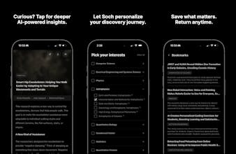
Secondly, when deciding the positioning of options to interact with an article, like bookmark or share, I explicitly places them in the detail page rather than the feed. So the user needs to at least navigate to the detail page, so save the article. This is one way of nudging the users gradually to try and learn more about something they found interesting, instead of mindlessly interacting with a feed.
Thirdly, the images that are generated, are designed to be muted and not overtly loud and attractive. The goal was to make the article content the primary focus which forces the users to actually read and not merely focus on the visuals. The images primarily serve the purpose of amusing the readers with their playful depiction of a rather serious idea.
Will continue optimizing the experience for evoking curiosity and wonder, rather than mindless consumption.
> how do you evaluate whether you’re succeeding?
I have added some anonymous client side metrics to understand if users are actually saving and going back to the articles. This I believe is a positive indicator that users are taking notes of ideas and actually circle back to them.
I also monitor if users are actually navigating to the detail page and scrolling through the extended summary.
Metrics like these will help me assess the efficacy of my strategy.
applaud the bravery in developing this against the human nature haha!
bug: when i click into the detailed page of the research, seems there's no way to get out of it. (I'm using iphone 16 pro).
also echoing @busmark_w_nika 's comment, it's gonna be a huge uphill battle to convert the behavior of the mass. Maybe in the future a potential direction can be directed towards students/youth where these topics can be more tied to their curriculum? As a parent I'd be more at ease knowing they are scrolling something remotely related to their school works than tiktok...
Coin Feed
@busmark_w_nika @colinhz Thanks Colin!
Regarding the bug, I believe you should be able to swipe right to go back to the previous screen? But I did notice earlier that it lacks an explicit back button. Thanks for the feedback, I will add the back button and it should be available as an OTA update.
Totally agree that securing mass adoption would be the biggest challenge. I met a school teacher while working in a cafe and she gave me the exact same feedback about how useful this could be if the content aligns with a class's syllabus. This is a great idea and I am taking down notes for the next iteration of the app.
Appreciate the feedback :)
I'm also working on a solution to the same problem but l've admit your solution's creative
is android coming?
Coin Feed
@eren_kiratli Yes, been focusing on iOS first, but since I built using Expo, I should be able to get Android out soon!
Love this concept—turning doomscrolling into curated research snacks feels spot on for how people actually use their phones today
Oh man I really love the design! Is there a personalization feature? The more you use it, the more personalized posts, visuals and language get for you?
Coin Feed
@amanudeshii That's my slightly longer term vision, to personalize the articles for the users. But so far it seems like this will have to be a paid feature so I can sustain the parallel streams of article generation. But in the current free version, users can select categories and sub categories , as the first layer of personalization.